Master of Fine Arts, Media Design, Defining Client Needs Projects:

Foundations of Typography, Challenge Exercises, Much Ado About Nothing
I began my project with the idea of creating three completely different posters. The first layout would be fun, playful and modern, the second layout would be clean and contemporary while the third layout would be bold and loud.
For the first layout, only one font was used for the design; Franklin Gothic Medium. This is an easy to read sans serif font with a medium weight and equal thickness of stroke. Using hierarchy by scaling the name of the play in the largest font leads the viewer to the most important subject. To distinguish the main subject, a black box underlines the title and is used to contrast the word "nothing." A feeling of unimportance and emptiness is given to the word "nothing" by flipping the word upside down. Text that is more relevant in size is somewhat smaller than the title while the text that is less relevant is sized smaller. Maintaining a balance in weight and type position allows for information to easily interpreted for legibility. Making the layout more fun and free flowing gives a unique feature to the design.
The second layout pushes the limit on the number of fonts used with a total of three. The first font; Simple Print, gives an elegant and sophisticated feel to the words "Much Ado" while the words "About Nothing" are set in the font Great Vibes for a care free and no worry feeling. The remaining text was formally laid out in Franklin Gothic Book for easy to read support and legibility. Scaling "August 15-28" larger than the remaining text gives more importance to the date and announces a time frame which then leads the viewer to the time and price of the tickets.
To achieve the bold look of the third layout, heavy weighted fonts were used to grab the viewers’ attention and give importance to the information. The Franklin Gothic family members were used in the creation: ITC TEE Book, Book, and Heavy. The more important information was set in Heavy, but to avoid shouting at the viewer, the text was set in lowercase. To continue with the bold look, it was contrasted by putting the text in white with a boxed in black background. To keep the poster interesting and the flow of information continually moving the words "William Shakespear's" was set in Book and balances the left side while other information is set in smaller size and balances the right side.


Foundations of Typography, Challenge Exercises, Grand Canyon
The Grand Canyon layout began with using a font that gave a since of height which would not over power the image. The font Tablet Gothic Narrow has a tall representation with medium weight and equal thickness in its stroke. The words “Grand Canyon” is the heading and main information that the viewer needs to quickly see and is therefore the largest of the words. Contrast and color was achieved by giving the text a thin black stroke and shadow in the water so the words won’t become lost within the image. The words “National Park” while still important was made smaller and placed on the right side and the web site text was placed on the left side for balance. To make the poster interesting and give the text a feeling of depth, a slight reflection of the Grand Canyon text was rippled in the water along with placing the raft in front of the text.

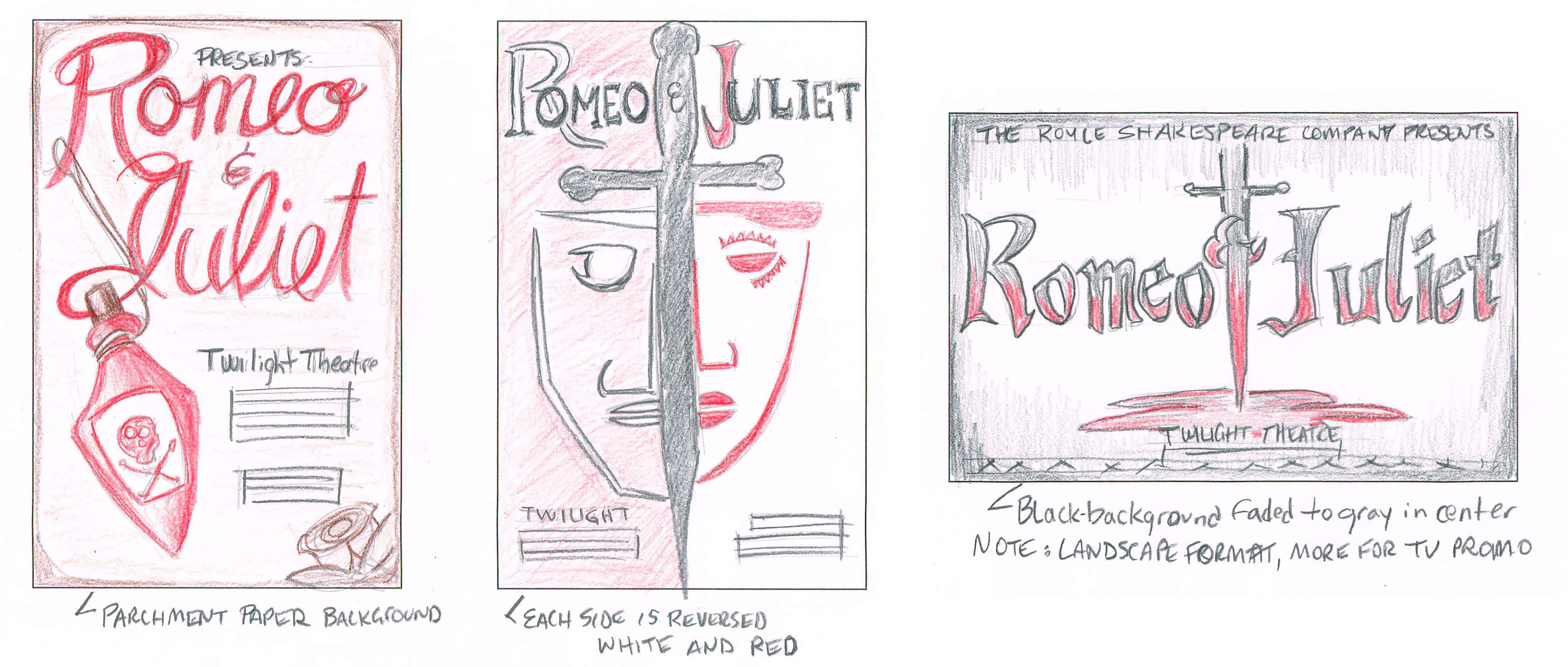
Sketches for Romeo and Juliet Poster Concepts
These sketches are for three different Romeo and Juliet layout concepts. Using typographic layout and accompanying images the end result will engage the viewing audience to attend the play. Each concept has a different look and feel and tells a story of tragedy. While the first two layouts will work as poster ads, the third concept will be in landscape format and can be used as a television layout promotional ad.

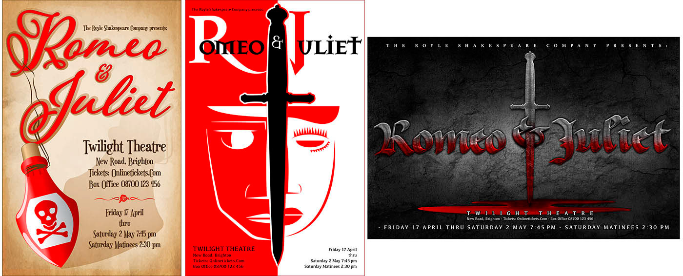
Final Romeo and Juliet Poster Layouts
These are the final layouts for the Romeo and Juliet concepts. The text and images are intended to engage the viewing audience by cohesively combining typography and images.
Each poster is a different style which plays to diverse interests. The first poster has the script font Adorns Pomander while the supporting text is set in the font Euphorigenic. The background is parchment paper with a graphic of a poison bottle in the same red color as the text Romeo and Juliet.
The second Poster shows line graphic images, each with half the face of Romeo and Juliet split by a dagger. The font used is Mason Serif. The poster will play off the opposite color of Red and white. This entire idea is the division of the two families and separation of Romeo and Juliet.
The last poster is in landscape format and would be used more for a promotional ad for television due to the orientation. This layout shows the dark and ominous tragedy using black and cracked textures and uses the Old English font Girvy. The sword is stabbing the ampersand while all the text is bleeding. Using both graphic and typography, the poster will tells a story of tragedy.