Design Integration
This course builds on new and previous projects by developing a more solid foundation and exploring new directions. Through further examination innovative methods and creativity is developed and media capabilities expanded in preparing for the ever-changing landscape of media design.
**NEW** Campaign Project Tiny Homes Campground
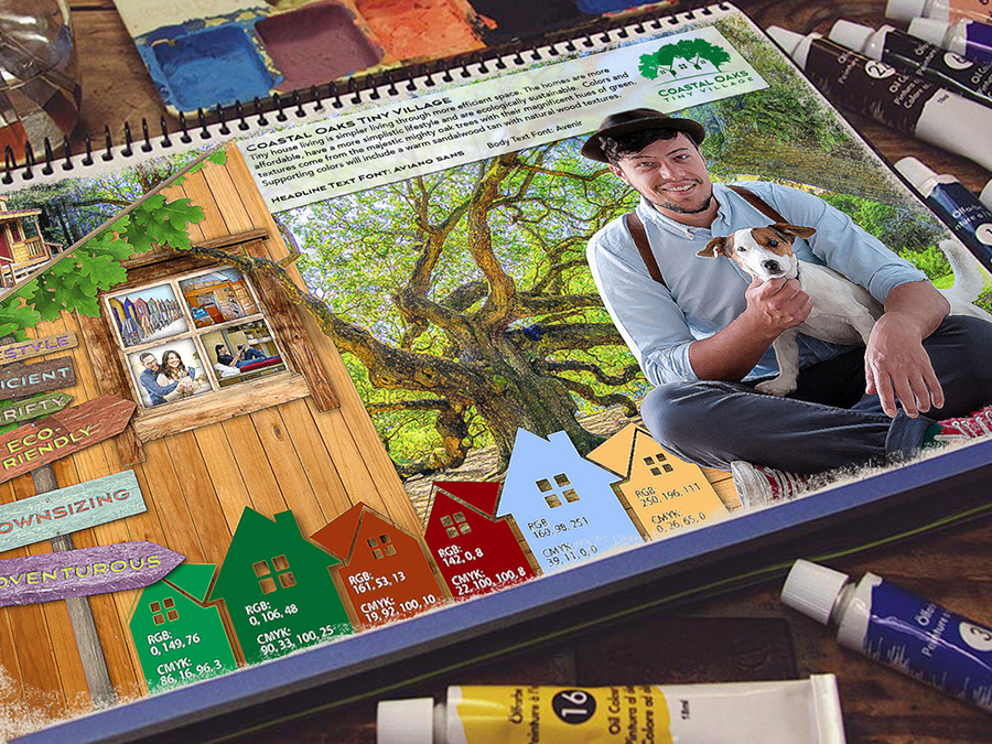
This campaign is for a tiny homes campground that affords consumers the opportunity to experience the tiny home movement. Through temporary tiny home vacation rentals individuals/couples can find out if this simplified lifestyle is something that they would like to permanently consider. The campground will have eight unique isolated community campsites each with eight tiny homes. These small pocket communities are distinctive campsites with individual themes which makes up the larger village. The village and campsites will be communicated through a new name, logo and stationary. Future media applications will include guerrilla marketing and a web interface package.
Sketches:
The first sketches were free flowing ideas that would quickly identify tiny homes to an audience. “It’s vital to keep an open mind and not limit yourself when sketching. Even if your ideas seem too far-fetched, it’s best to make a visual note of every thought that crosses your mind” (Airey, 2015, chpt 7). Sketches 3, 4, 6 and 8 were selected for further examination and development.
Airey, D. (2015). Logo Design Love, Keep it simple. Retrieved May 07, 2017, from http://ce.safaribooksonline.com/9780133812589/
Roughs:
Originally the name was Coastal Cove, as the refined logos began to be developed the name was changed to Coastal Oaks. Many of the original sketches contained indigenous loblolly pines. These pines are weak and seasonal hurricanes decimate these trees. To strengthen the brand identity a strong tree was selected, the oak. To identify the logo with the local area and eastern North Carolina region the word “coastal” was selected. “The right name has the potential to become a self- propelling publicity campaign, motivating word of mouth, reputation, recommendations, and press coverage” (Wheeler, 2012, p. 23).
As logo number 4 was being refined, some ideas from logo 5 was incorporated with the way the text was handled. Logo number 6 had a polished classy business look that shows the strength of the oaks with the negative space of the tiny home which helps to frame the house and make it stand out. Logo number 8 was created for a playful look but does not add to the professional brand identity.
Wheeler, Alina. Designing Brand Identity: An Essential Guide for the Whole Branding Team, 4th Edition. John Wiley & Sons P&T, 10/22/12. VitalBook file.
Comps:
The Coastal Oaks Tiny Village logo is in the final stages of completion. Logo number six was chosen for further exploration. Here, some fine tuning with a different font choice gave the logo a tone and feel of a fashionable and professional tiny home campground. “Typefaces have great influence over people’s decisions, helping to further emphasize the message of a brand. The typefaces that you choose can effect whether the right message is being communicated to the viewer” (Hardy, 2011, Part II, Chapter 8). Additionally, it was suggested to add more than one home to the logo so that it would represent more of a village. “There’s always room for more creativity, refinement, and experimentation. Don’t be afraid to create variations of your original idea: Remove elements, add elements, and play with the proportions and the weight of the drawing” (Hardy, 2011, Part II, Chapter 7). This revision contained six new variations; 6a through 6f of the logo. The oak trees and negative space are similar to the original version number 6 while the changes show different home and text combinations. The final logo is circled in red.
Hardy, G. (2011). Smashing Logo Design: The Art of Creating Visual Identities. Retrieved May 10, 2017, from http://ce.safaribooksonline.com/book/graphic-design/9781119993568/
Stationery:
To elevate the campaign to a higher level and improve work, one of the areas revisited explored how to build a strong brand using print media. Print media such as stationery, brochures, signage and mailers assist in building a strong brand. To build a successful, long lasting and memorable brand there must be a consistent use in the logo, color, typography and images. The image must be distinctive and stand out from other brands. This brand must connect with the customer and become synonymous with trust and value. “Your personal reputation, like a company’s brand, lies outside your control. It’s not what YOU say it is—it’s what THEY say it is. The best you can do is influence it” (Neumeier, 2007, p. 19). Print media allows the aesthetic qualities of the font, colors and images along with the physical texture bring the print to life and establishes brand recognition.
The business card is an example of how the logo would look at is smallest size. According to Gareth Hardy “a simple logo design improves how the logo performs at smaller sizes—a complex logo may look fine on a billboard, but on a business card or letterhead, all that detail will be lost” (2011, Chapter 3: The Key to Success).
Hardy, G. (2011). Smashing Logo Design: The Art of Creating Visual Identities. Retrieved May 14, 2017, from http://ce.safaribooksonline.com/book/graphic-design/9781119993568/
Neumeier, M. (2007). ZAG: The Number-One Strategy of High-Performance Brands. Retrieved May 17, 2017, from http://ce.safaribooksonline.com/book/branding/0321426770
Advertisement:
To add to the stationery and branding media an advertisement was created. The advertisement speaks to the audience about a simple lifestyle and invites them to try and experience the tiny house life. The headline that was created for the ad bridges the gap between the audience and the Coastal Oaks Tiny Village brand. The question peaks the interest of the viewer by stating “We can tell you the secret for a happy life” this in turn creates curiosity and engages the viewer to read the body text to find the secret. “The essential rule is to always understand that your job is to create a bridge between the brand or the company you’re talking about and the people you’re trying to talk to. And that bridge better be rewarding. It better be likable, engaging, entertaining, charming, interesting, funny, fun. . . . You’ve got to create a bridge that, one, doesn’t allow them to ignore it and, two, makes them feel good for the 30 or 60 seconds they’ve spent with that company or brand” (Felton, 2013, p. 197).
Felton, George. Advertising: Concept and Copy (Third Edition), 3rd Edition. W. W. Norton & Company, 20130805. VitalBook file.
